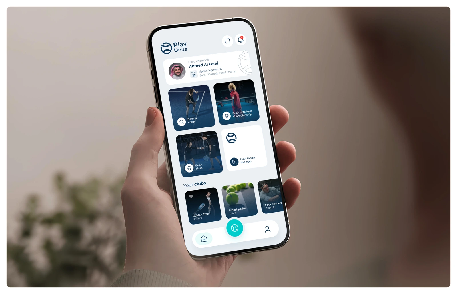
Strong visual design begins with a clear decision: what matters most, what comes next, and what can disappear. Before choosing colour or motion, I want to understand the job the screen needs to perform.
Reduce the noise
A product can contain sophisticated rules and still feel simple when its hierarchy matches the user’s priorities. The work is not to remove useful capability; it is to reveal it at the right moment.
I give every element a reason to exist. Does this label explain something? Does this action move the task forward? Does this card need a container, or is spacing enough? These questions prevent visual furniture from competing with content.
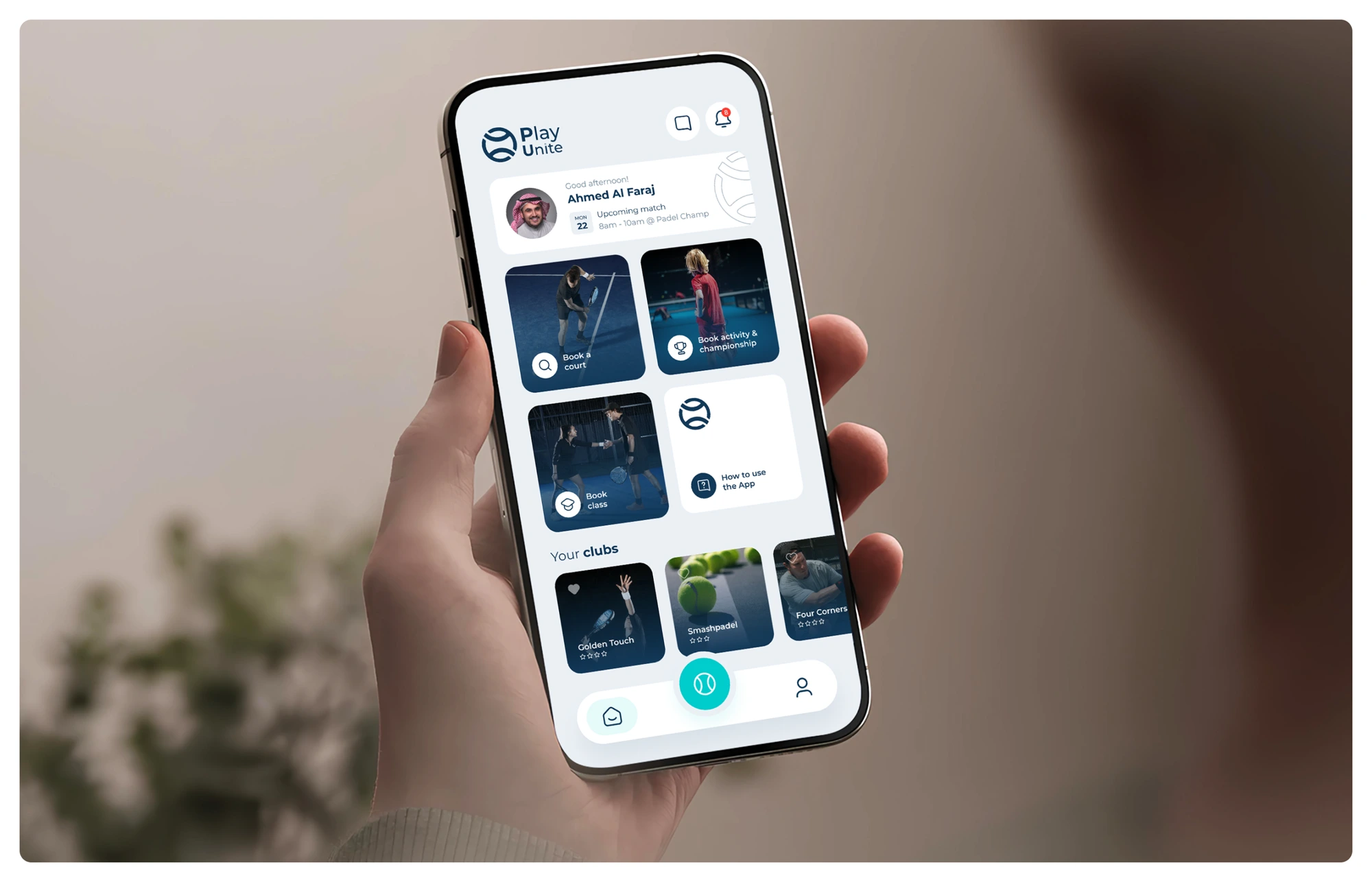
Hierarchy is a promise
When an interface makes something prominent, it promises that the element deserves attention. Consistent hierarchy helps people scan and act without repeatedly decoding the page. Precise language matters too: “Save changes” creates more confidence than “Continue” when saving is what will happen.
Decoration should strengthen meaning, never compete with it.
Once the structure is calm, expression becomes more powerful. Restraint is not the absence of personality; it is the confidence to let the important things speak first.